To design, prototype, and scope a new pro evaluation experience that inspires confidence in customers to choose the right pro, mobile first.
I was responsible to research and explore various solutions in the redesign of our current pro evaluation experience. The goal was to go wide, then build incrementally with focus.
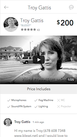
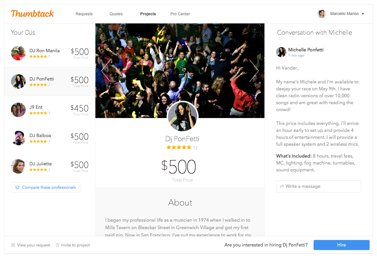
The current interface has a fundamental problem: there's no clarity in what the customers should do next. There are around 10 different buttons and a mix of content that doesn't help at all in the task of choosing and hiring.
The goal is pretty clear: build a more focused, faster and personalized product experience for customers to increase confidence in hiring the right pro. But how do we achieve that?
Help pros look trustworthy by showcasing their expertise
Guide users through the experience with clear next steps
Help the customer identify which pro is right for him
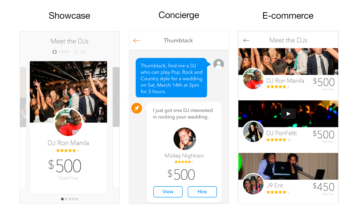
What's the best way to introduce custom quotes and the professional's profile to a customer in a delightful and comprehensive way? Our team explored three different interaction paradigms, each one with a set of pros and cons. Our idea was to generate wireframes and a prototype for each one of them and interview a couple people to understand the tradeoffs of each option.
We learned there are two types of people: the first group cares a lot about the personal message from the pro and how much the quote is customized to their needs. They are trying to connect more with the pro's personality, like photos and bio (emotional behavior). The second group looks at the quote and profile very pragmatically and searchs for statistics and information that will give them a better sense of this pro's expertise (rational behavior).
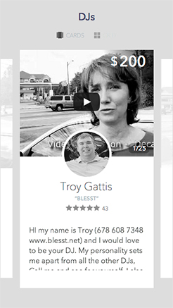
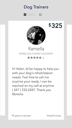
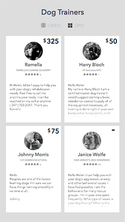
What's the best way to introduce the quotes to the customers? I searched for references in other products and came up with three different ways, that the team called Paradigms. The high-fidelity wireframes below were prototyped in Invision and battle-tested in user interviews. All the options had good pros and cons, but the e-commerce model was a clear winner.
A short iteration cycle of wireframing - prototyping - interviewing users was important in order to unlock the right questions and get closer to the best design sooner.
All those learnings and feedback from users drove the design direction. I explored dozens of different designs that got reviewed from everybody in the team and other stakeholders - VPs and the CEO. We decided to go with a hub and spoke navigation to match the different mindsets our users have when going through this moment of the experience.
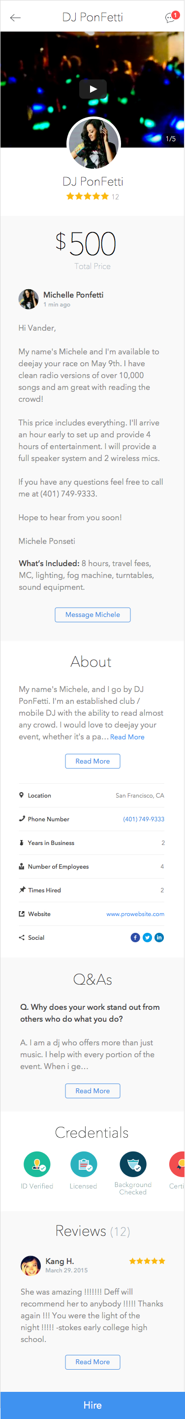
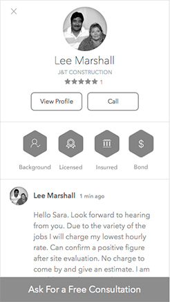
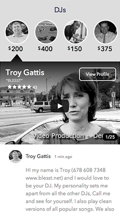
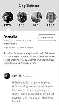
Through videos, photos and audio, the professional can express his expertise, experience and personality.
The personal message introduces the professional and explains his price, but it’s also an invitation for the customer to communicate.
Customers often have questions they wanna make about the service and pro’s expertise. Professionals also love to receive messages from customers because it shows them this person is engaged and interested.
User interviews taught us customers have different priorities. By offering a hub and spoke navigation to different profile’s content, we allow them to quickly scan the sections and decide what they want to see first.
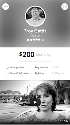
They are definitely the meat of the quote/profile. 10/10 customers want to read reviews when comparing pros. Even though it’s the last section on the screen, you can tap on the shortcut below the pro’s avatar at the top.
The main action on this page is always floating on top of the content at the bottom of the page. Always one tap away from the customer.
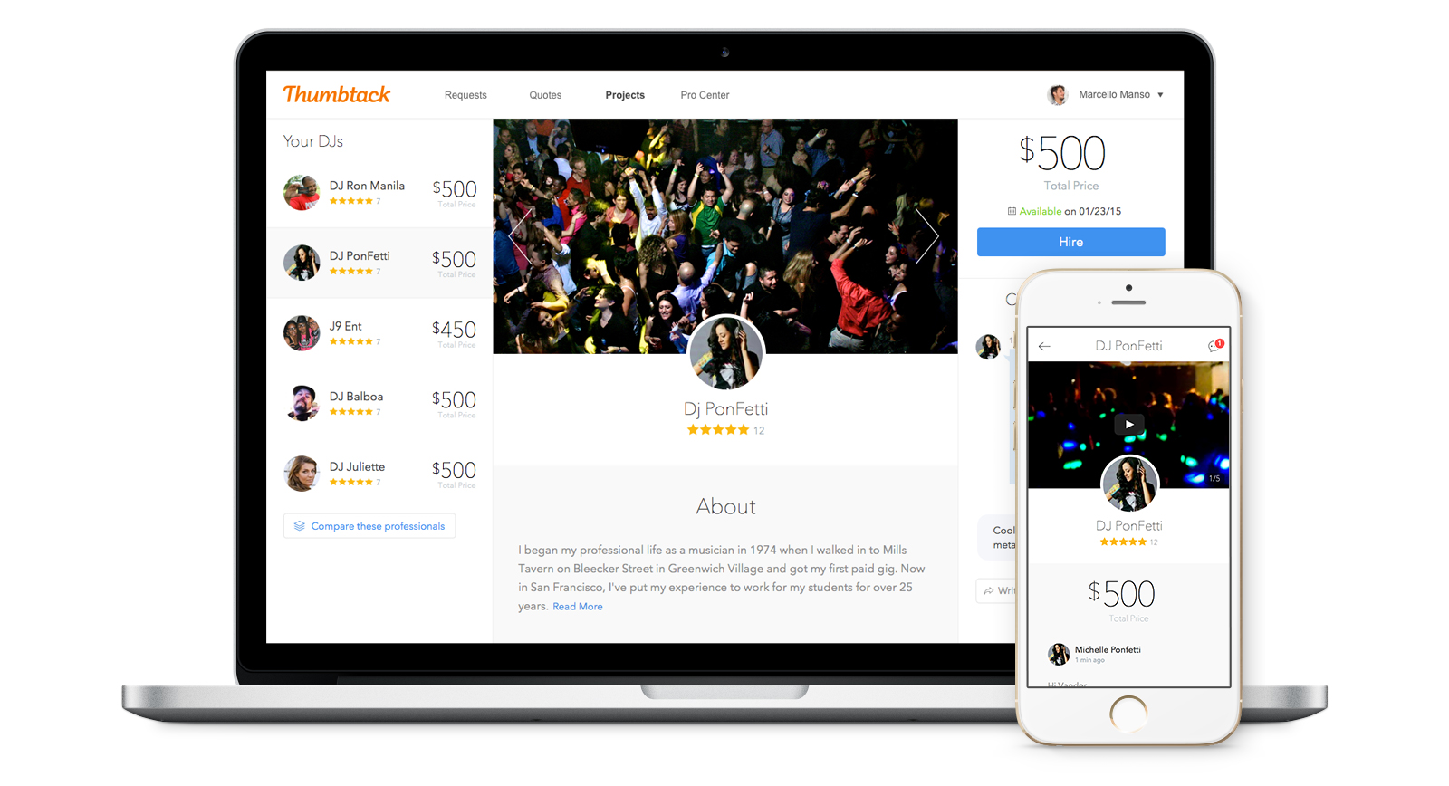
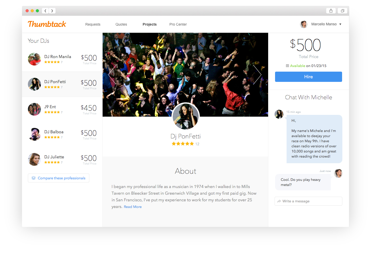
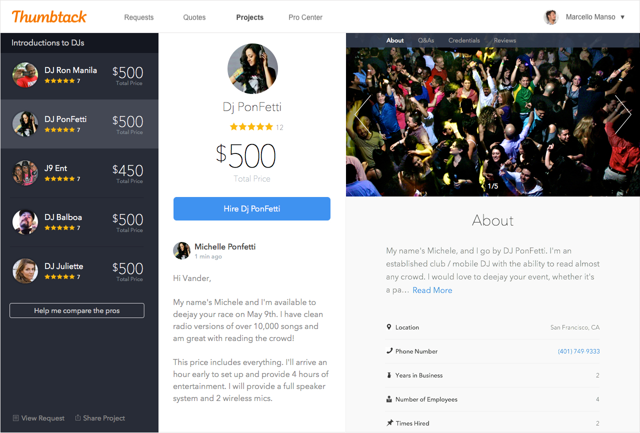
Now that I had a strong solution for mobile, it was time to adapt that for a desktop experience, where I could take advantage of the screen sizes to show more relevant content. I designed more than 60 different versions with different strenghts and weakenesses. It was super-helpful to have the team engaged in those questions. We narrowed down those options to 3 versions, which I hack-prototyped in html and css in order do run user-interviews. Here are some of those layout explorations:
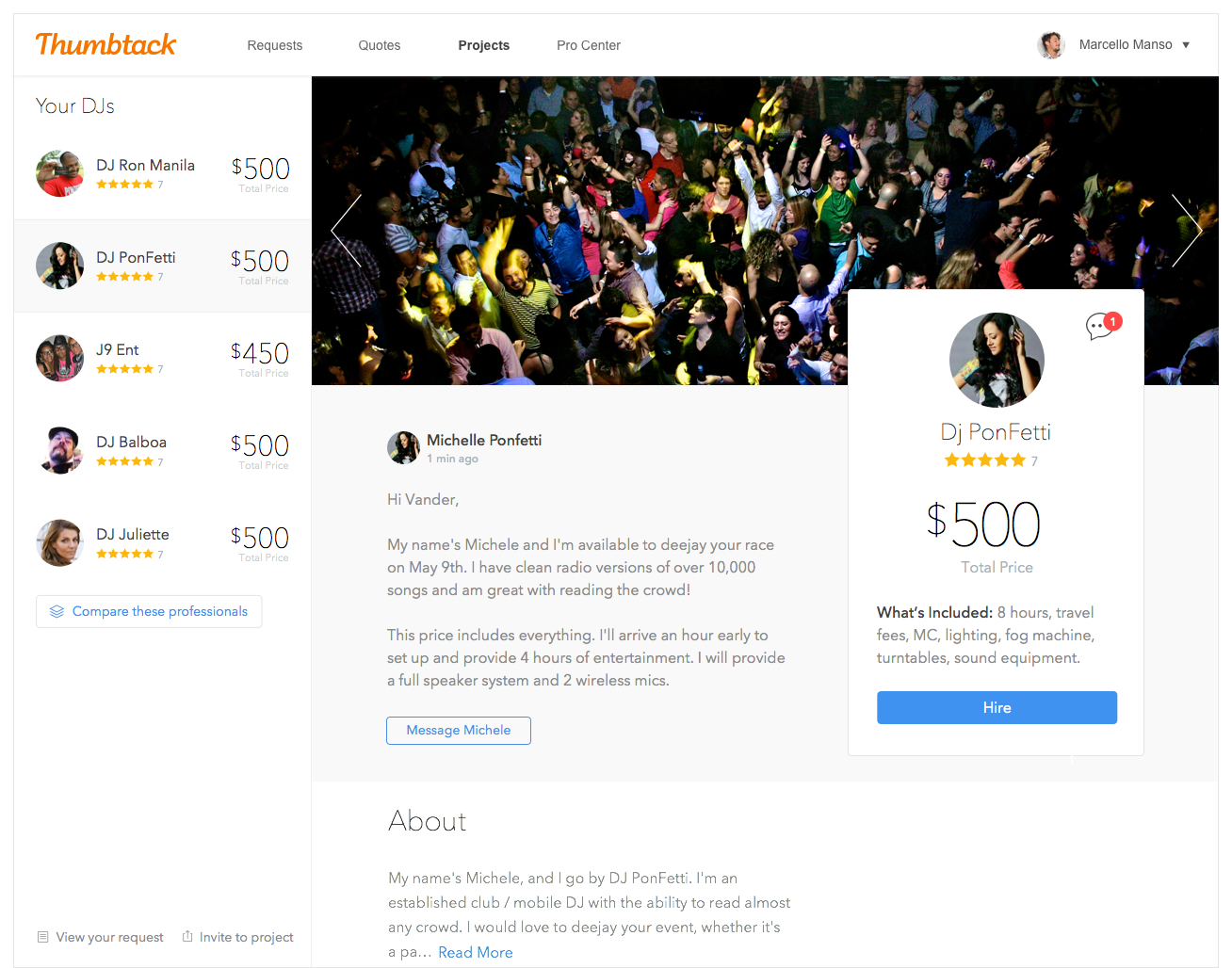
This is a glance of the final design so far - both mobile and desktop versions. The next steps are to build this out and start running A/B tests to understand how it performs and impacts the business.